UX Research
UX Research
Preserving Taíno Culture Through Design
Designing an onboarding experience that keeps users engaged and connected to their heritage.
My Role //
Lead UX Researcher
Client //
Casa Areyto via Tech Fleet
Timeline //
13 Weeks
Figma Notion Google Workspace Zoom
Tools Used //
Project Overview
The Journey to Revitalize a Language
The Taíno language is now at risk of being lost forever. But what if technology could help bring it back?
Our team partnered with Casa Areyto to design a mobile learning app that would make the language accessible to new learners while staying true to its cultural roots. This wasn’t just about usability, it was about honoring a culture and making learning intuitive for a new generation of speakers.
My Role
As Lead UX Researcher, my mission was to refine the onboarding experience, ensuring that first-time users could easily engage with the app while preserving the authenticity and meaning behind the language.
Additionally, I oversaw research operations, hiring and mentoring four apprentices with the support of two co-leads. Working in an agile environment, I ensured research was both rigorous and adaptable to the evolving needs of the project.
Collaborating with a cross-functional team of 25, I navigated complex challenges, conducted in-depth usability studies, and led biweekly demos to keep Casa Areyto engaged and aligned with user needs.
The Impact
Measurable Success
Usability testing showed an 88% task success rate, and the System Usability Score (SUS) of 87 confirmed the app’s excellent usability. These results validated our approach—an intuitive onboarding flow that engages users while preserving cultural authenticity.
The Problem
Identifying Core Challenges
The primary challenge for the Taíno Language Learning App was to create a user-friendly and engaging platform that not only teaches the Taíno language but also preserves and respects the cultural heritage of the Taíno community. The app needed to address several key issues:
Cultural Relevance: Ensuring the app's content and design were culturally sensitive and accurate.
User Engagement: Making the learning process engaging and effective through gamification.
Usability: Designing an intuitive onboarding process to enhance user retention and satisfaction.
Initial Research and Goal Alignment
Overcoming Initial Hurdles
At the start, unclear goals threatened to slow progress. To gain clarity, I worked with the project manager to uncover past research, reviewing documents and analyzing where Phase 1 had left off. By connecting with previous teams, we aligned objectives, ensuring a clear path forward.
Team Formation and Cross-Functional Communication
Leadership & Strategy
Team Formation
From over 100 applicants, I carefully selected four UX research apprentices, prioritizing research skills, cultural awareness, and linguistic expertise. With a servant leadership approach, I mentored the team, fostering a collaborative and supportive environment alongside two co-leads.
Ensuring Strong Cross-Functional Communication
To bridge gaps between teams, I implemented a liaison system, ensuring a researcher attended Design and Writing team meetings. This kept communication seamless, aligned efforts across teams, and ensured our research directly informed design decisions.
Define
Defining Initial Goals
With our team in place, we were ready to establish our roadmap for Phase 2. Our objectives were determined by reviewing previous phases and collaborating with the UX Design and UX Writing teams to understand their goals, which influenced our direction. We used tools such as Notion, FigJam, and Slack to execute our planning. With our team aligned, we established primary and secondary objectives:
Primary Objective: Refine the app's onboarding process through remote moderated usability testing, ensuring it meets user needs and expectations.
Secondary Objective: Continue research on gamification strategies to enhance user engagement, documented in a comprehensive white paper and visualized through an affinity diagram.
To streamline research efforts, we formed sub-groups, each tackling specific objectives in parallel.
I led usability testing (detailed in the next section) while ensuring collaborative reviews and iterations for a cohesive outcome. My role in gamification research was primarily advisory, offering strategic input while the team executed the work.
Research Planning
Usability Testing: A Comprehensive Approach
In this phase, I took on a multifaceted role to ensure thorough and effective usability testing.
Usability Guide Creation
Collaborating with a teammate, I developed a structured usability guide with five tasks, four interview questions, and a System Usability Scale (SUS) assessment to capture both qualitative and quantitative insights.
Participant Coordination
I led participant outreach, leveraging past and new contacts from Casa Areyto. To refine our selection, we created a pre-screening survey. I also managed scheduling via LettuceMeet, Calendly, and Google Sheets, ensuring smooth test sessions.
Data Analysis and Reporting
Post-testing, we synthesized findings using affinity diagrams and prioritization matrices. I compiled an in-depth report and created a user flow, ensuring clear, actionable recommendations for the next iteration.
Schedule of research teams and Usability Guide
Research Methodology
Usability Test: Key Insights & Recommendations
Our usability testing provided valuable insights into user interactions with the app. Here are the key findings and our recommendations based on the study:
Single Ease Question (SEQ) Results:
Task 1: 100%
Task 2: 66%
Task 3: 91%
Task 4: 96%
Overall Rating: 88%
These results indicate that while most tasks were perceived as easy, Task 2 scored significantly lower, suggesting room for improvement.
Recommendations
Let's take a quick look at the recommendations that emerged for improving Task 2.
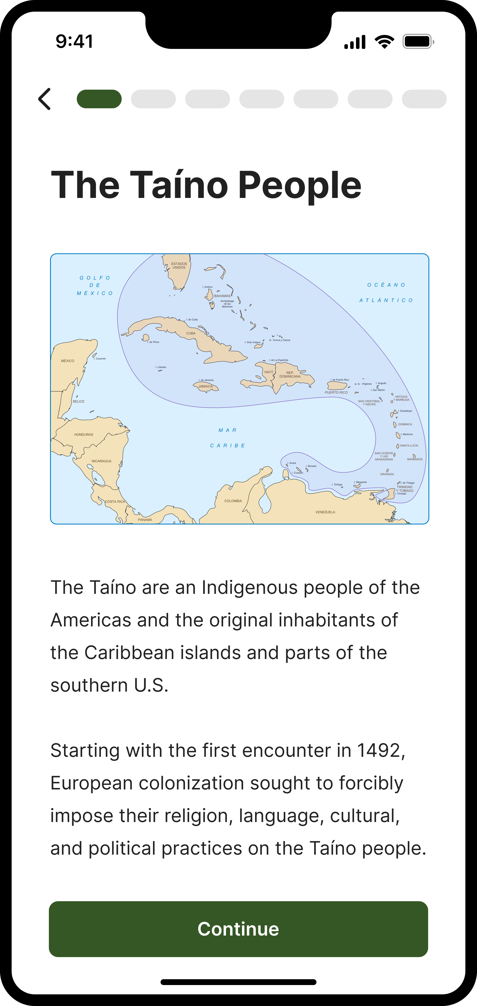
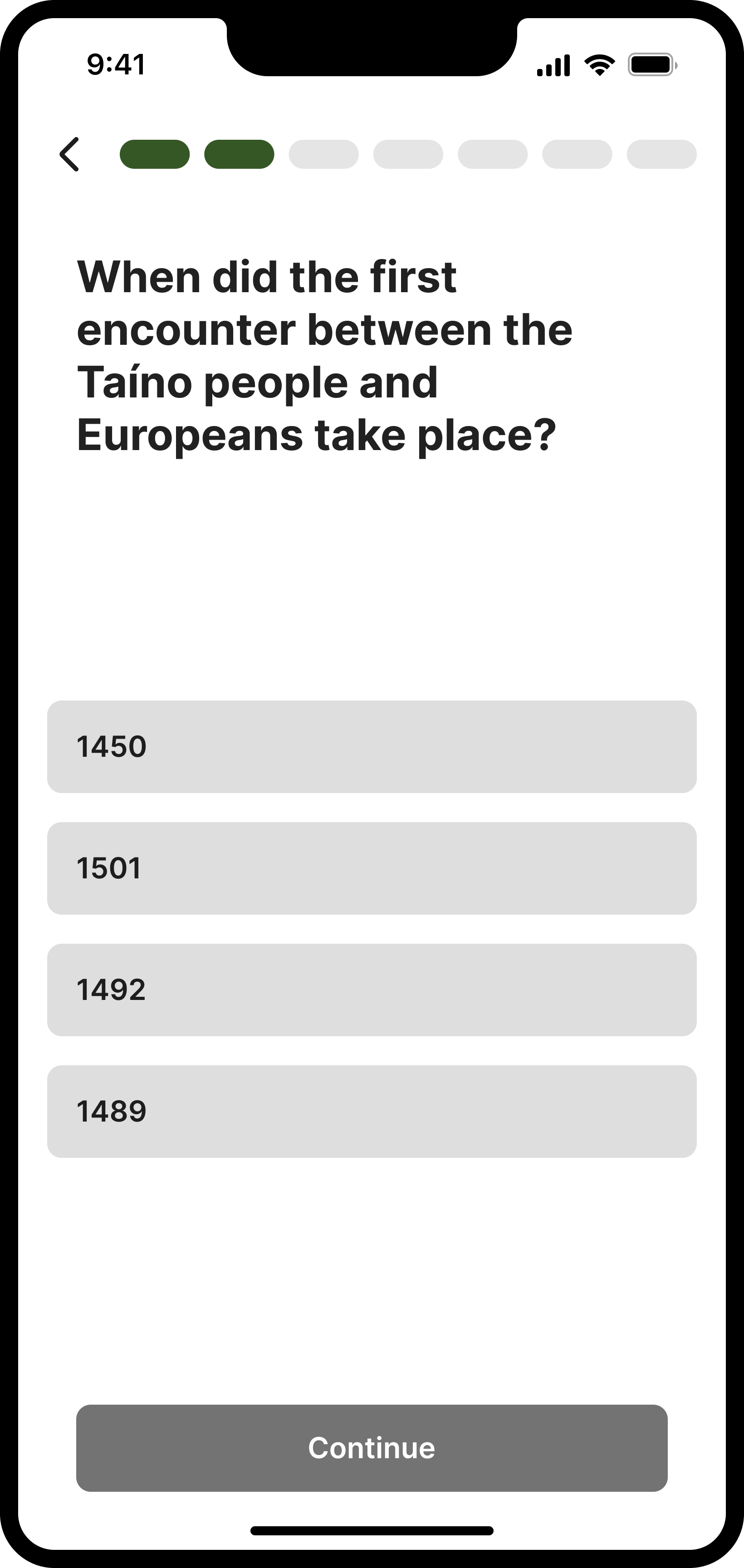
Task 2 Instructions: Participants were asked to "Please continue through the intro experience, covering the history of the Taíno people and culture, and recognizing variants."
"Why do I have to know 1492? I didn't care about this date without understanding its importance."
"I was taken by surprise with the quiz"
Users were highly engaged but found the history lesson overwhelming and unexpected, leading to several concerns:
Overload in Onboarding: Users encountered too much detail at this stage, which should primarily focus on onboarding the user and guiding them to create an account.
Context of Colonization: Users felt the app suggested Taíno culture began with colonization, neglecting its rich pre-colonial history. Brief snippets of history need to be clearly contextualized within the broader Taíno heritage or explain the app's purpose in revitalizing nearly extinct culture. The content must be more direct.
Unexpected Assessment: The assessment surprised users, leading to poor retention and frequent use of the back button, extending the time on task excessively.
Recommendations:
Replace the in-depth 20-screen lesson with a concise overview of 1-3 screens. This will showcase what the app offers, including history and cultural learnings, making onboarding more engaging and less overwhelming. This approach will better manage user expectations and prevent fatigue.
System Usability Scale (SUS) Results
SUS Score 87
Although this score indicates excellent usability, reflecting high user satisfaction with the app's design and functionality, there is still room for improvement.
"I might download it initially, look at it and then delete it. I would consider using this more if the instructional flow is improved and there is increased relevance and authenticity to the heritage of Taíno people."
Drawing from our research, I prepared the "Rationale for the New User Flow" document, outlining key improvements. The revised onboarding experience prioritizes cultural storytelling and personal engagement by removing assessments and clarifying the app’s purpose for a more intuitive experience.
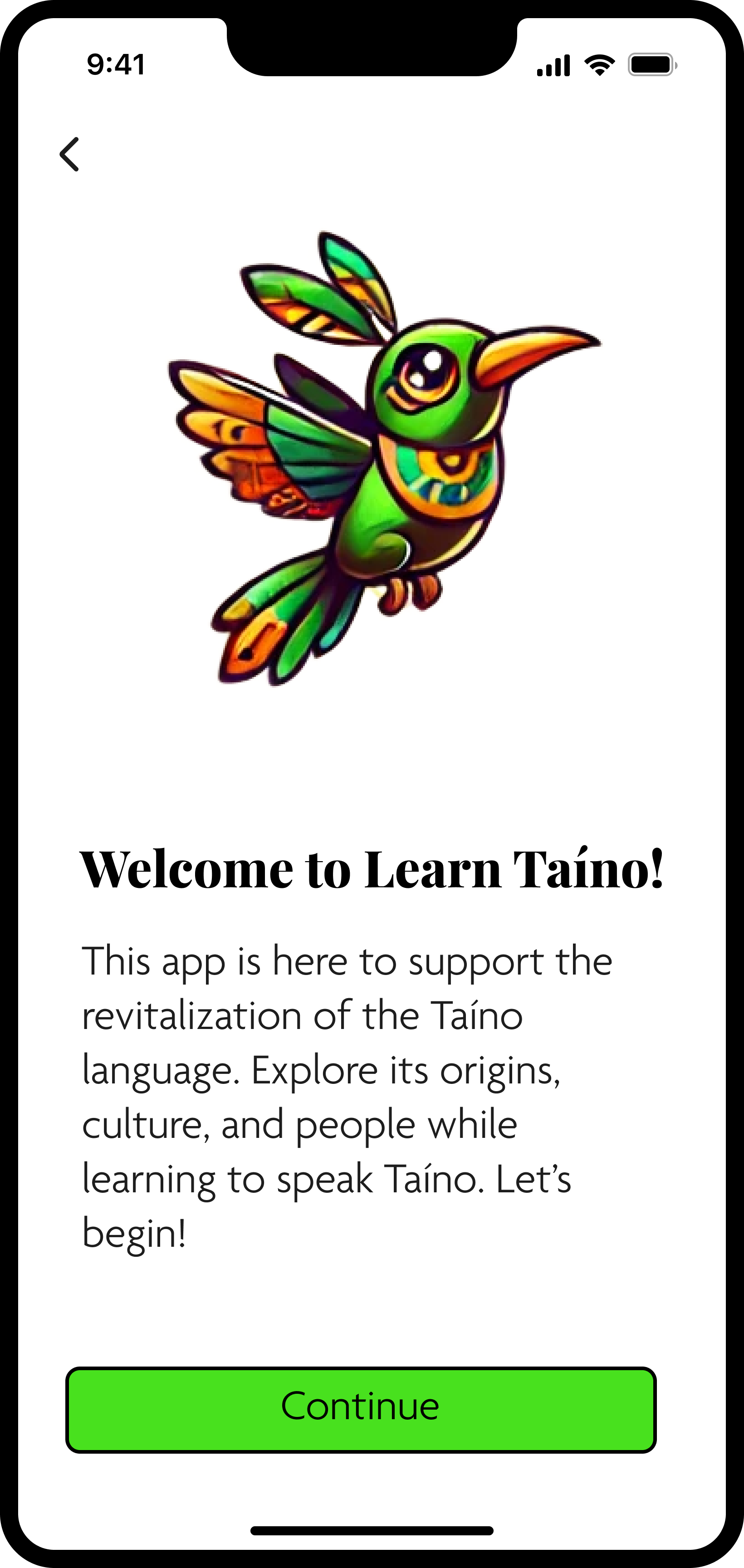
To guide Design and Writing, I created a rough user flow reflecting our recommendations. After team discussions, we replaced the history lesson with a single screen that clearly conveys the app’s purpose—making the onboarding both user-friendly and culturally rich.
Further Actions:
Clearly communicate that the initial phase is just onboarding, setting appropriate expectations for users.
Provide an overview of the historical content users will encounter, rather than detailed lessons.
Start with a focus on the early Taíno people pre-colonization to establish a sense of identity and pride.
Updated user flow: history lesson now condensed to a single screen introducing the purpose of the app.
Iterations
Research-Driven Design
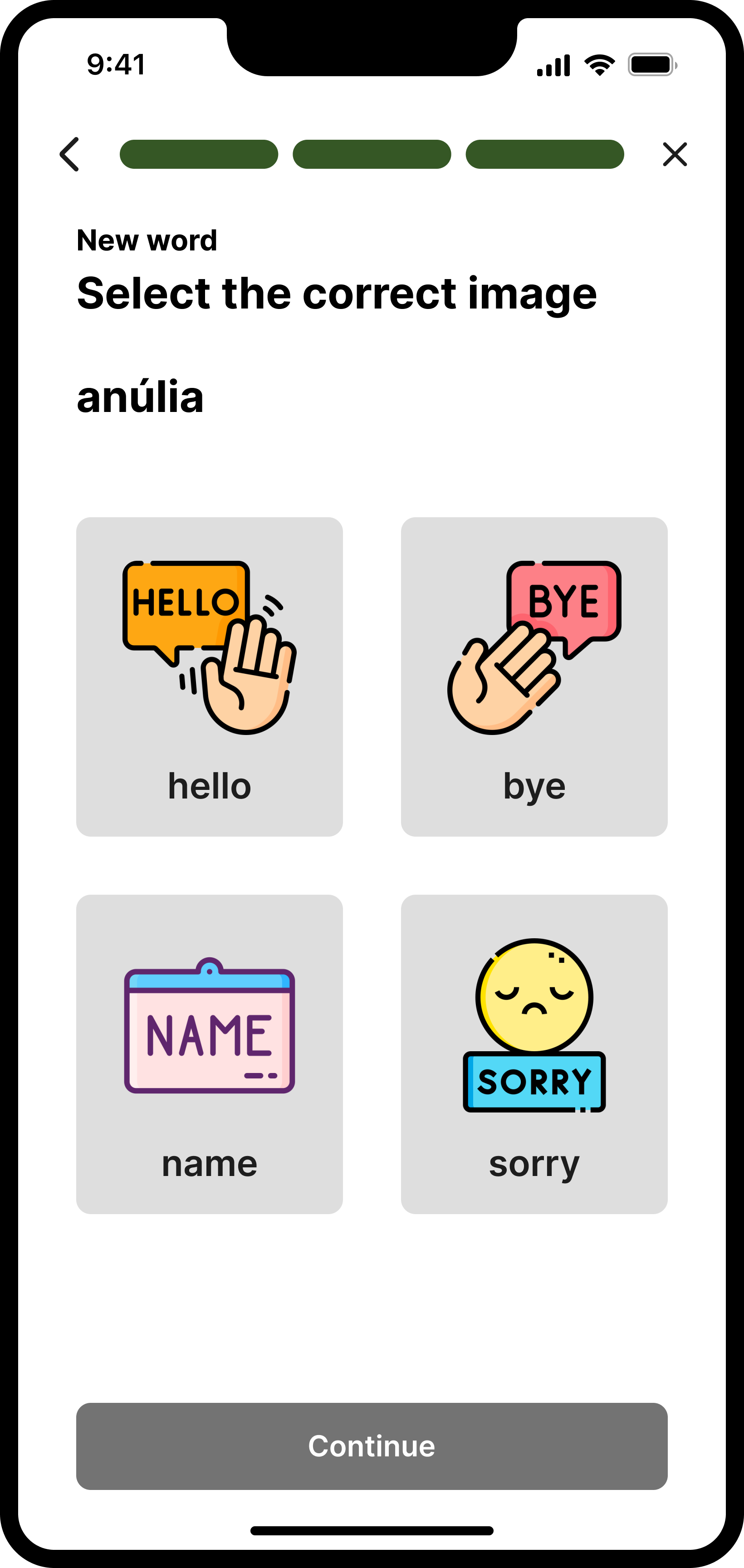
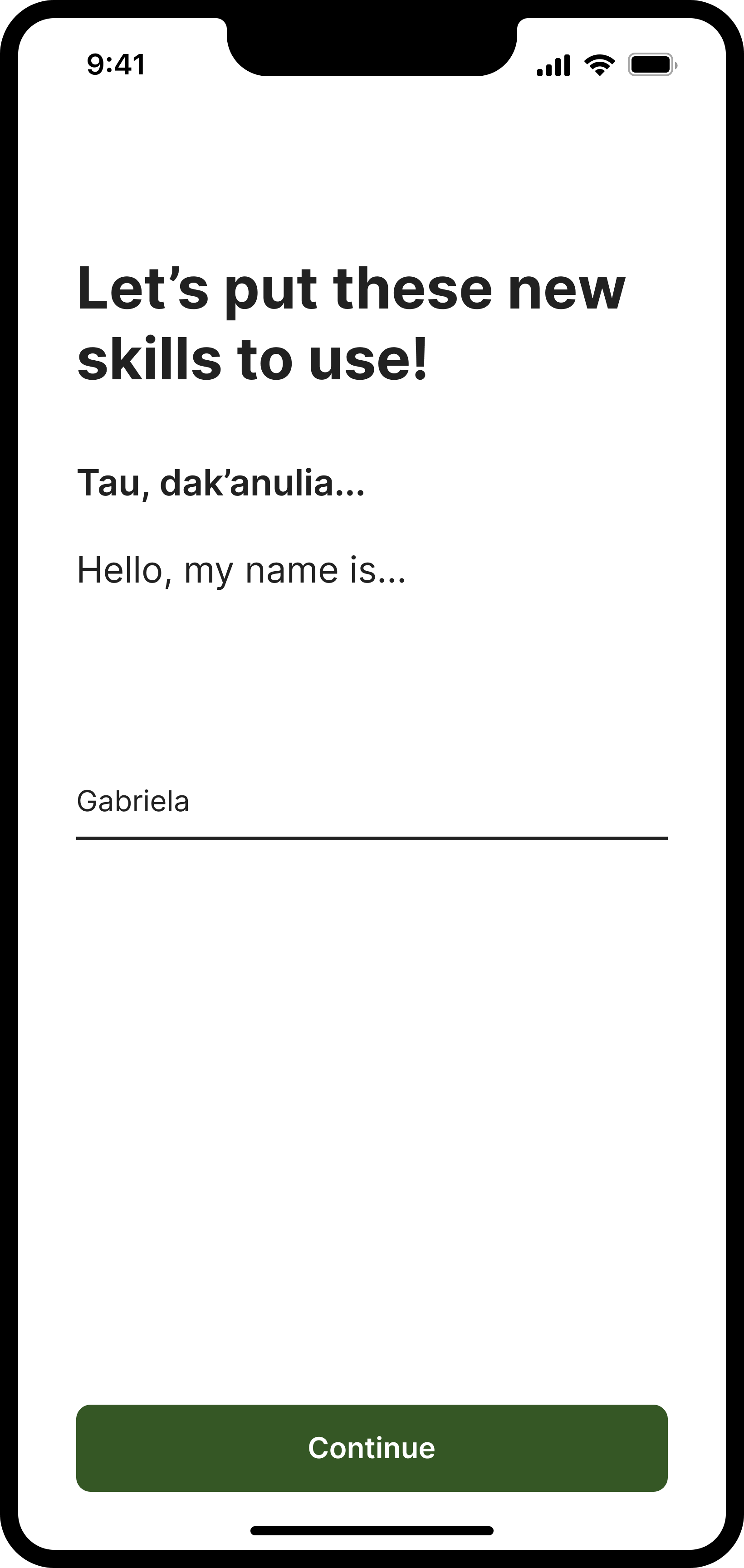
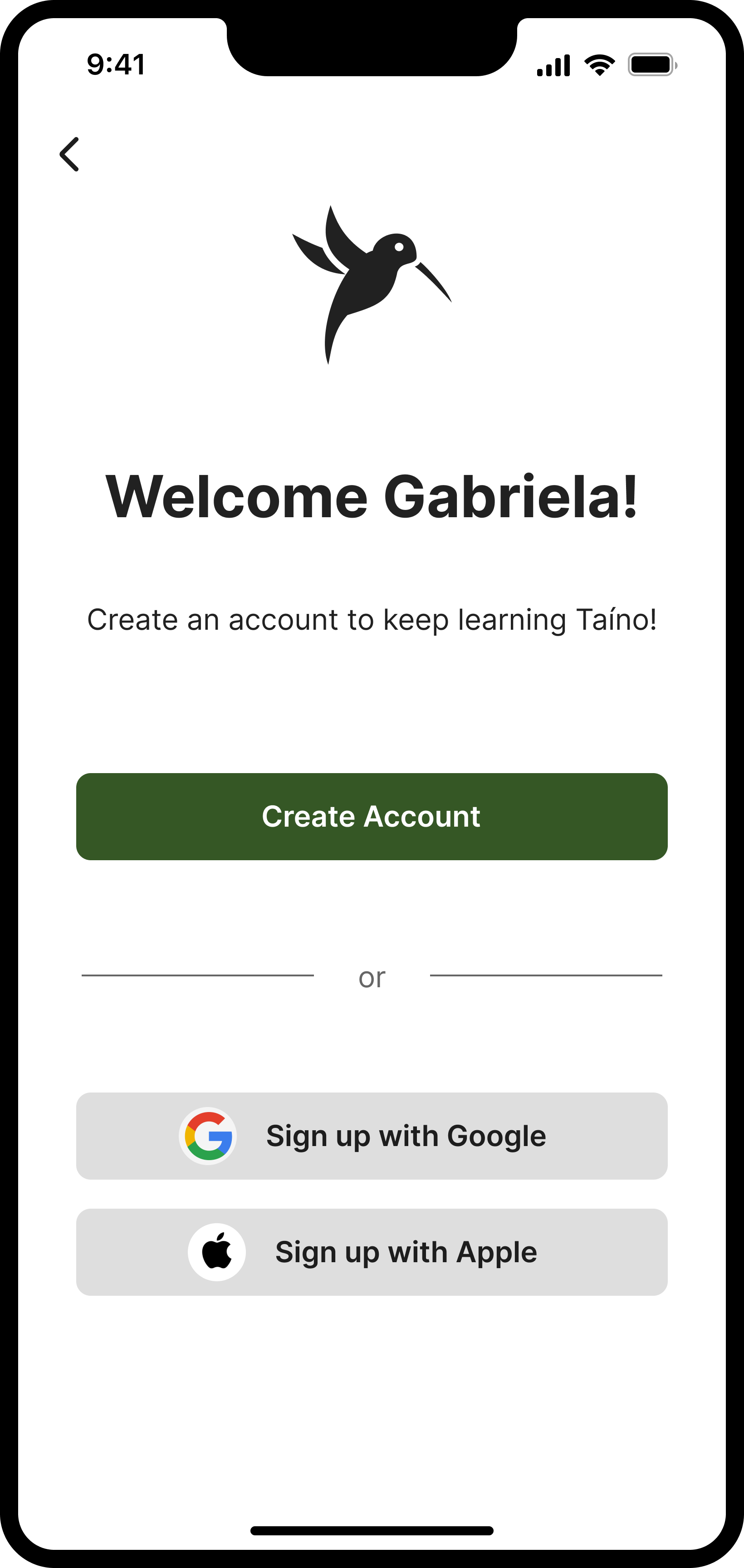
Usability testing showed that the history lesson in onboarding was overwhelming. To improve engagement, I created a mockup illustrating a revised Task 2, replacing the lesson with a simple app overview. This helped the UX Design and Writing teams visually interpret our recommendations.
The team determined that the history content would be more effective as a dedicated lesson after account creation, allowing for better context, deeper learning, and improved user engagement.
Mockup I designed, showcasing the updated content and design, providing a visual representation of our recommendations.
Cross-Functional Collaboration
Progression & Rewriting the Roadmap
By the fourth and final sprint, it was clear our initial plans needed adjustments. Through cross-functional discussions and a review of revised team goals, we identified the best way to support each other.
While we originally planned another round of usability testing, the Design team’s timeline made this unfeasible. Instead, we shifted focus to home screen wireframe recommendations, leveraging existing research to guide improvements.
Adapting the roadmap kept the project on track. Continuous stakeholder feedback and biweekly demos informed these updates, while Notion and FigJam ensured efficient sprint planning and progress tracking.
Zoom in on sprint planning: Initial Sprint 4 planning vs adapted Sprint 4 planning
Research Planning
Addressing Emerging Challenges
Early brainstorming sessions explored language lessons, cultural insights, and community-building, using workshops, wireframing, and AI-assisted sketching. However, the scope expanded too quickly, lacking a focused vision for the app’s core offerings.
A review of our research revealed that home screen recommendations weren’t yet feasible, prompting us to refocus efforts before moving forward. Key questions arose:
Should lessons be self-guided or more structured?
How should history be integrated with language learning?
Should we tell a linear narrative, or offer macro and micro lessons?
How can we build a community of practice to enhance user engagement and relevance? One user aptly highlighted the importance of community, stating:
"Without a community of practice, I feel that this app, even if well designed, would lack relevance and eventually be forgotten."
These unanswered questions highlighted the need for more focused research. Without a clear vision, we couldn't make validated recommendations for the home screen content. Recognizing this gap, we decided to gather additional data to ensure our future recommendations would be both substantiated and effective.
Examples of brainstorming the Home Screen: sketches, lo-fi wireframes, and AI productions.
Reseach Methodology
Closing Research Gaps
To bridge existing research gaps, we designed a comprehensive survey—prioritizing clarity and effectiveness over immediate deployment due to time constraints.
Our process included:
Asynchronous brainstorming to generate questions
Dot voting to prioritize key topics
Affinity diagramming to organize insights
Team-wide review to refine and finalize the survey
This structured approach ensured the survey was thorough, well-organized, and ready for future implementation.
Project Handoff
Transitioning to Phase 3
To maintain continuity, I coordinated the team in meticulously documenting our findings. Each member was responsible for organizing artifacts in Google Drive and Notion, ensuring easy access for future teams.
We created a comprehensive slide deck summarizing:
Key accomplishments
Retrospective insights (what worked and what could be improved)
Recommendations for Phase 3’s research focus
Conclusion
Key Learnings and Reflections
As I reflect on the project, I have gained valuable insights into what worked well and areas that need improvement. These key learnings will help refine my approach in future projects.
What Worked Well
Ambassadors/Liaisons at Cross-Functional Meetings: Maintaining strong communication across teams ensured everyone stayed informed and aligned.
Twice-Weekly Working Meetings: Effective workshops held twice a week facilitated ongoing collaboration and problem-solving.
Mini Groups for Deliverables: Using small teams to tackle specific tasks allowed for focused and efficient work.
Great Adaptability Cross-Functionally: Although we didn’t complete as much research as initially planned, we excelled at reacting and reassessing. Understanding the realistic timeframes for each team helped in setting more achievable goals. We had hoped to do a second round of iterations, but time constraints prevented this.
What Could’ve Been Better
Clear Handoff: Ensuring early communication of next steps to aid planning would have prevented initial delays in this project phase.
Responsibilities: Clarifying team responsibilities to avoid overlapping research tasks is crucial. There was some overlap with the Writing team, and although we tried to partner, the intent wasn’t communicated well enough.
Taíno Community Representation: Including apprentices and/or leads who are part of the Taíno community is essential. We aim to work with the community, not just create for them.
Final Reflections
Leading the UX research for Phase 2 of the Taíno Language Learning App was a profoundly rewarding experience. It underscored the importance of thorough research, effective communication, and adaptability in design. The insights gained have laid a strong foundation for the app's future, ensuring the preservation of the Taíno language for generations to come.


