Website Redesign
Website Redesign
Unearthing a Better eCommerce Experience for D Joyce Minerals
My Role //
UX/UI Designer
Client //
Timeline //
3 Months
Figma Miro Google Workspace Zoom Hotjar
Google Analytics 4
Tools Used //
Project Overview
Redesigning for Growth and Continuity
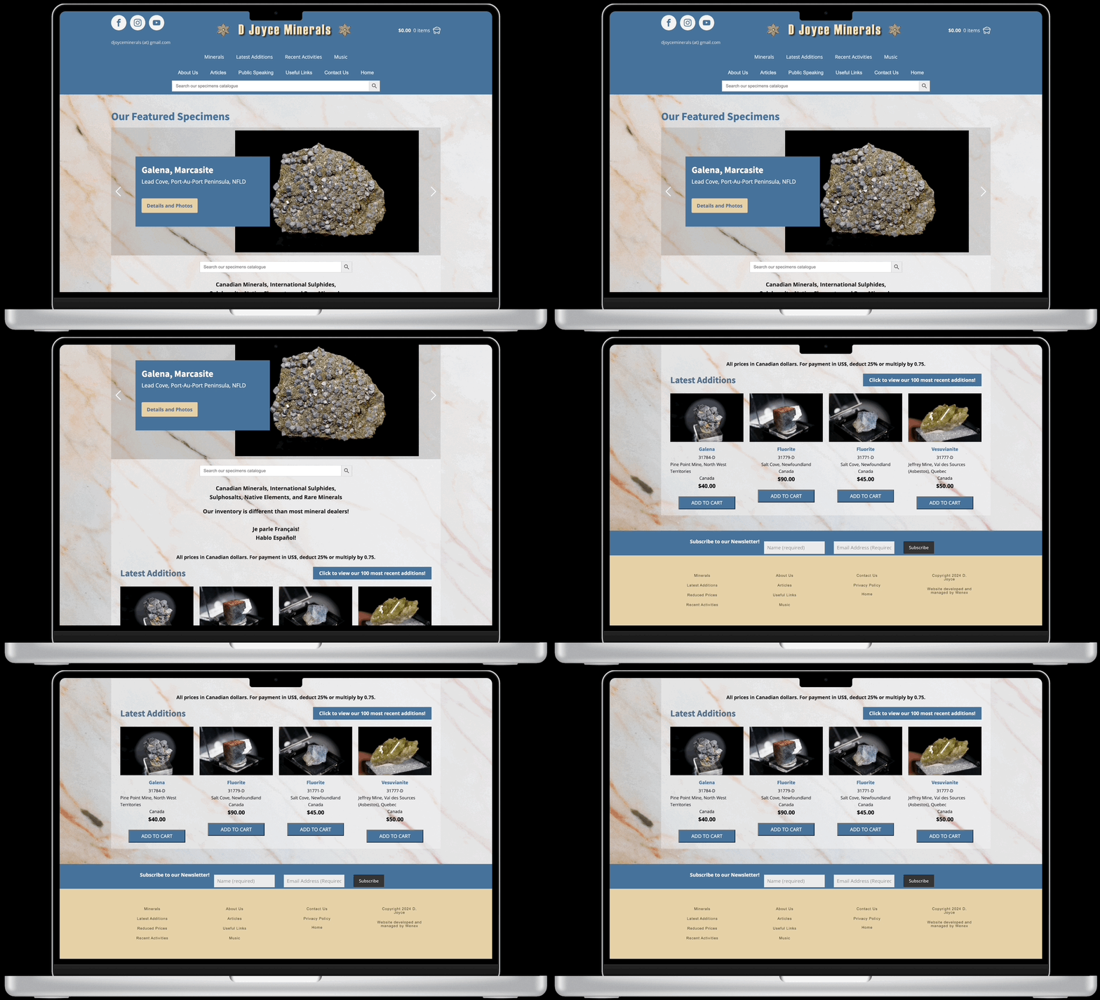
D Joyce Minerals, a reputable online retailer for mineral collectors, needed a comprehensive website redesign to better serve both its loyal, experienced clientele and attract a new generation of novice buyers. The existing website, though functional, was outdated and did not effectively support either group.
My Role
My role was to lead this strategic redesign, focusing on improving usability, enhancing the shopping experience, and ensuring that both seasoned collectors and beginners could easily find and purchase products.
The Impact
Measurable Success
Impact of the New Shop All Page:
Within the first month of implementation, the newly launched Shop All page has quickly become one of the top-performing sections of the site. Data collected from Google Analytics and Hotjar shows:
Shop All captures 33% of total views, outperforming the pre-existing Latest Additions (10%) and Localities and Collections (9%).
Shop All has an engagement time 191% higher than Latest Additions.
Majority of users actively engage with the new filter system.
The redesign also led to significant improvements in usability. Usability testing revealed a 13% increase in task ease (SEQ) and a 10% rise in overall satisfaction (SUS), reflecting a smoother, more intuitive user experience.
Key features like the advanced filters and quick shop were instrumental in improving product discovery and purchase flow. These data-driven results, combined with regular stakeholder feedback and collaboration, secured full stakeholder buy-in and commitment to the redesigned website vision.
The Problem
Identifying Core Challenges
❌ Initial Design: Targeted at experienced mineral collectors, leading to a steep learning curve for novice buyers.
❌ User Pain Points: Novice buyers struggled with navigation and felt overwhelmed by the lack of intuitive filtering and search options.
“I’m new to this, and it’s really hard to find what I’m looking for.” - Novice User Feedback
❌ Engagement Issues: The site’s outdated structure failed to retain experienced users due to missing modern conveniences.
💪🏼 Redesign Challenge: Create a website that caters to both novice buyers needing guidance and experienced collectors seeking efficiency and depth.
Research Plan
Laying the Groundwork
To kick off the project, I conducted an in-depth interview with the stakeholder to understand the core challenges and goals. This conversation shaped the research plan, ensuring it addressed both user and business needs:
Stakeholder Insights: Gained a clear understanding of business objectives and user frustrations.
Persona Development: Created personas to align the design with user needs.
Heuristic Analysis: Identified major usability issues on the current site.
Usability Testing: Captured real-time user feedback to uncover pain points.
Journey Mapping: Mapped user experiences to highlight critical areas for improvement.
Competitor/Market Analysis: Benchmarked against industry standards to identify opportunities.
Prioritization Matrix: Focused efforts on the most impactful improvements.
This research plan laid the groundwork for a redesign that would be both user-centric and strategically aligned with the stakeholder's goals. I began gathering and analyzing data.
In the following sections, I’ll explore the most impactful findings from this research that directly informed the design strategy.
If you’d like to skip ahead to the key findings and insights, click the button below!
User Personas
Guiding Design with User Insight
To craft a user-centered redesign, I began by immersing myself in understanding the target audience. Through a detailed stakeholder interview, I identified two key user groups and developed proto personas to ensure the design would meet their needs:
Mason Quarry - Current Customer
Mason, a mineral enthusiast, values detailed information and a seamless shopping experience. Recognizing his loyalty, I focused on preserving the aspects of the site he relied on while introducing improvements that wouldn’t disrupt his experience.
Sandy Shale - New Customer
Sandy, new to minerals, represents an untapped audience. He’s eager to learn but requires guidance. My challenge was to create a design that educated and engaged Sandy, making his exploration intuitive and his journey smooth.
Sandy’s persona became the focal point for the research methodologies, as understanding and addressing his needs was crucial for expanding the site’s appeal.
Balancing Mason’s familiarity with Sandy’s need for guidance was essential. By ensuring that both user types were considered, I aimed to create a redesign that was both inclusive and effective in attracting a broader audience.
Heuristic Analysis
Comprehensive Site Evaluation
As part of the redesign process, I conducted an in-depth heuristic analysis of every page on the D Joyce Minerals website, meticulously evaluating the usability and functionality of the entire site. This analysis revealed a number of critical issues, with the product page standing out as particularly problematic:
Search Functionality: Required users to input precise, often technical terms, which alienated less knowledgeable users.
Popular Searches: Offered limited, narrow options that restricted exploration.
Minimal Information in Product Lists: The product links offered very little information and lacked photos, making it hard for newcomers to understand what each link was. While adequate for users searching by locality, the lists didn’t provide enough detail or context for those unfamiliar with the products, leading to a confusing browsing experience.
These insights highlighted the need for strategic design improvements to enhance overall usability and user satisfaction. The findings from this analysis set the stage for targeted solutions that would address the core issues identified.
Usability Test
Key Insights & Recommendations
To validate my findings and better understand user behavior, I conducted remote usability testing with five participants who aligned with the Sandy Shale persona—savvy in e-commerce but not mineral experts. The objective was to observe real interactions and pinpoint pain points.
Key Insights
Perceived Professionalism: Participants felt the site lacked polish, with one commenting,
“It feels like a hobbyist's passion project.”
Navigation Overload: Users found the navigation straightforward but overwhelming due to excessive text. One participant noted:
“The navigation is simple, but there’s too much text on the page. It’s overwhelming,”
Product Discovery Frustration: A common frustration was the lack of filtering options, as one participant expressed,
“Having filters would make exploring so much easier.”
These insights highlighted critical areas for improvement, particularly in enhancing the site's professionalism, simplifying navigation, and improving product discovery through better filtering options.
Quantitative Metrics: Measuring Usability
To complement the qualitative insights, I used the Single Ease Question (SEQ) and the System Usability Scale (SUS) to quantify the user experience.
SEQ: Measures the perceived difficulty of specific tasks on a scale of 1 to 7, with higher scores indicating easier tasks. The SEQ averaged 81%, suggesting moderate task difficulty across the site.
SUS: A broader measure of overall usability, the SUS rates user satisfaction on a scale of 0 to 100. The site scored 85%, indicating that while it was somewhat usable, there was still room for improvement.
These metrics provided a clear, data-driven understanding of where the site excelled and where it needed refinement.
Journey Mapping
Visualizing the User Experience
The journey map for Sandy Shale, a new customer exploring the D Joyce Minerals website, revealed key pain points that informed my design strategy. By visualizing Sandy's interactions, I identified where the experience fell short and where strategic enhancements were needed.
Key Insights
Outdated Design: "This page feels outdated; is it still active?"
Product Discovery Frustrations: "I don’t know how to find different products; there aren’t any filters."
Insufficient Product Details: "I feel okay about the information provided but could use more details."
Checkout Hesitation: "I won’t complete my order today… It doesn’t feel like a secure process."
Opportunities for Improvement
Advanced Filtering: Simplify and streamline product discovery, addressing major user frustrations.
Quick Shop Feature: Enhance the shopping experience by allowing users to view more product details and easily add items to their cart without losing their place.
Additional Features: Improve FAQ and policy pages to build trust and enhance transparency.
This journey map was instrumental in distilling complex user needs into actionable design solutions, setting a clear direction for the website’s modernization and feature enhancements
Research Findings
Culmination of Research: Prioritizing Modernization and Key Features
My research identified the need for 12 new features to significantly improve the website’s user experience. To prioritize these, I created a matrix that distilled the insights from my analysis. After evaluating their potential impact and complexity, I aligned with the stakeholder on the most crucial features.
Focus Features
Advanced Product Filtering: Crucial for simplifying product discovery and making the site more intuitive.
Quick Shop: Streamlines the purchasing process, reducing friction and improving user satisfaction.
Although I designed all 12 features, this case study will focus on these product filtering and quick shop as they are anticipated to deliver the most significant impact.
Lo-Fidelity Solutions
From Concepts to Wireframes
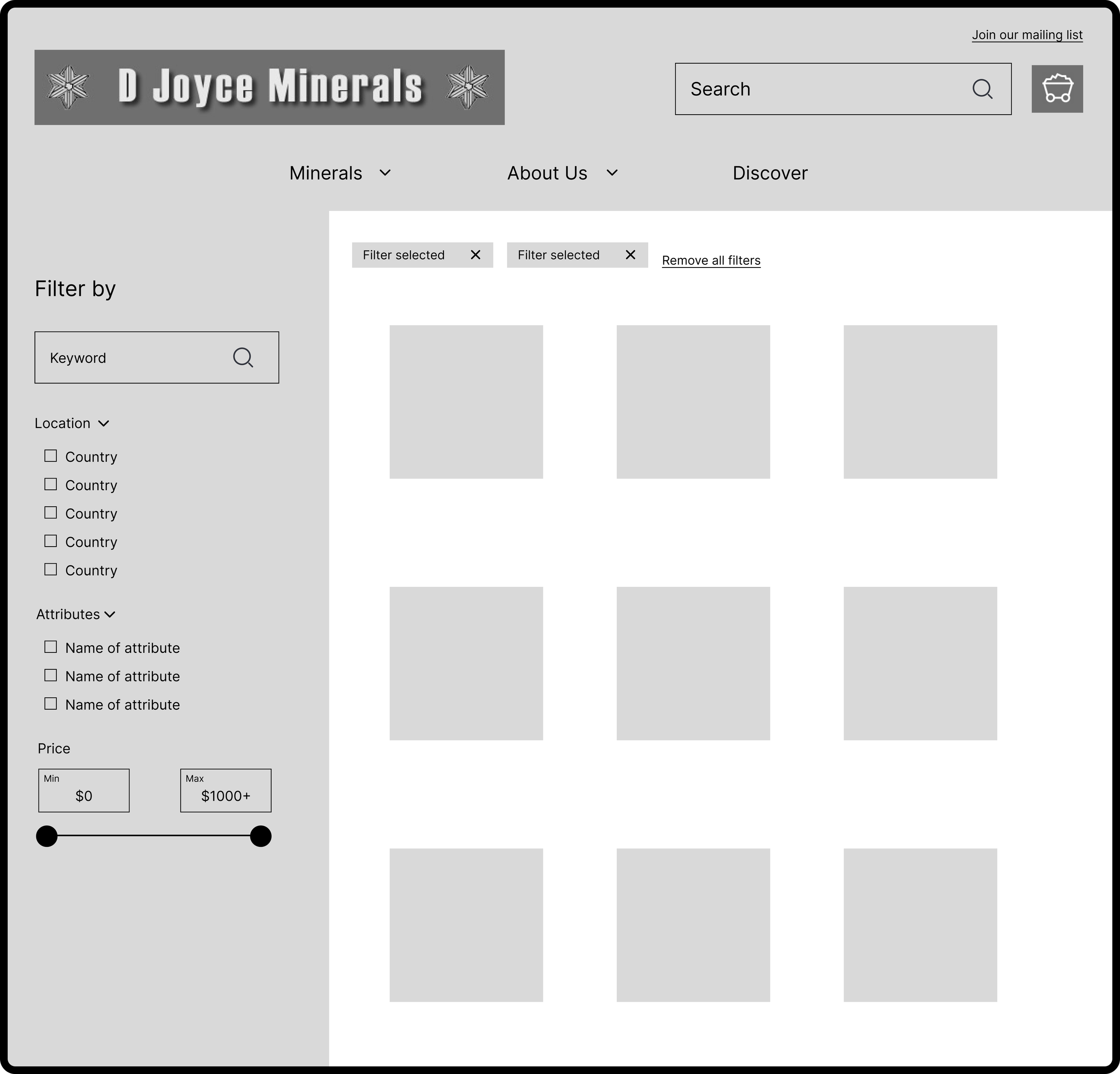
With the key insights from my research and journey mapping in hand, I transitioned into the design phase, beginning with lo-fidelity wireframes. These initial sketches were essential for exploring different layouts and features before committing to more detailed designs.
Key Features
Advanced Filtering: The wireframes introduced a simplified yet powerful filtering system that would allow users to easily narrow down product options based on their needs.
Quick Shop: I sketched out a pop-up feature enabling users to view detailed product information and add items to their cart without losing their place on the page, streamlining the shopping experience.
Challenges
Balancing Simplicity and Functionality: The challenge was to create a design that was both intuitive for novice users and powerful enough to meet the needs of more experienced customers.
Iterative Refinement: As I moved forward, these wireframes would undergo multiple iterations based on usability feedback to ensure the final design was as effective as possible.
Branding
Crafting a Cohesive Identity
Brand Identity
In the initial discussions with the stakeholder, I delved into the desired vision for D Joyce Minerals. The goal was to position the brand as a trusted authority in minerals, emphasizing expertise, natural beauty, and community. This led to the creation of a voice chart, guiding every design decision to ensure consistency.
Brand Guidelines
To maintain a cohesive look and feel across all platforms, I developed comprehensive brand guidelines. These included:
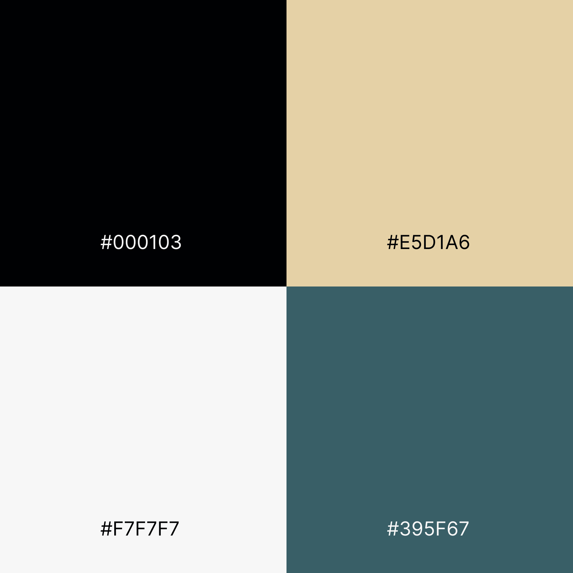
Color Palette: Earthy tones like #E5D1A6 and #395F67, representing expertise and reliability.
Typography: Merriweather for headers (classic and authoritative) and Open Sans for body text (modern and readable).
BEFORE
AFTER
Logo: Updated with a sophisticated typeface and an authentic mineral photograph, reinforcing professionalism while honoring the brand's heritage.
This branding work ensured that D Joyce Minerals’ identity was not only visually appealing but also aligned with its values and market positioning, providing a consistent experience across all touchpoints.
Hi-Fidelity Solutions
Bringing the Product Page to Life
In the hi-fidelity stage, I focused on refining the advanced filtering system and quick shop functionality to enhance product discovery and usability.
Advanced Filtering System
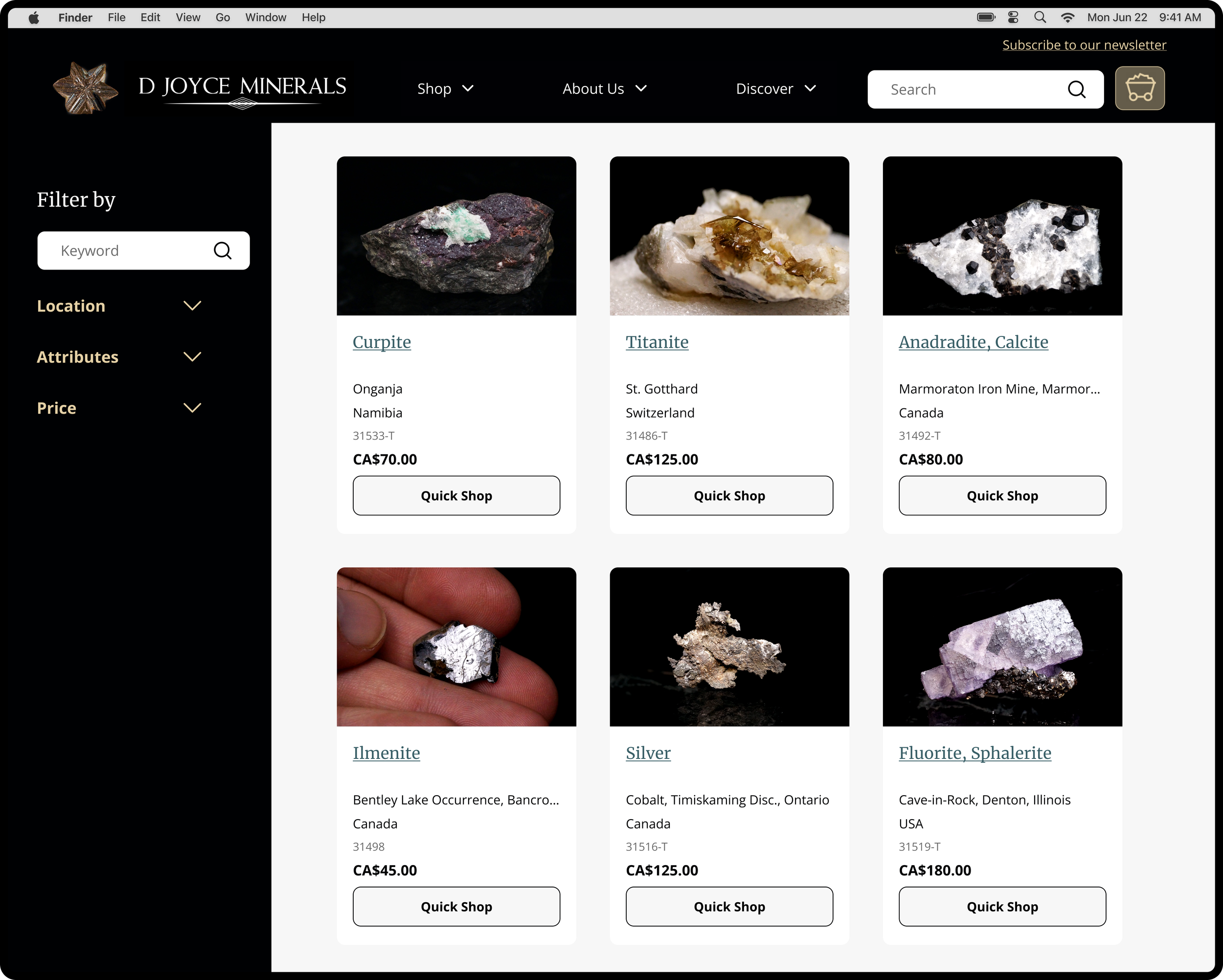
Users can now easily filter by Location, Attributes, and Price, enabling them to narrow down product results efficiently. The filters are intuitive and visually distinct, as seen in the close-up filter view, ensuring a smooth, user-friendly experience.
Selecting a filter, such as "Namibia," dynamically updates the product listings to match the chosen criteria, helping users find relevant items quickly.
Product Results and Quick Shop
The product results page showcases products in a clean, organized grid, each accompanied by a Quick Shopbutton. This feature allows users to access detailed product information and add items to their cart without navigating away from the page, as seen in the images provided.
The sort by option provides flexibility, allowing users to organize products by criteria like newest, price, or alphabetical order, which addresses feedback from the usability testing.
These hi-fidelity designs aim to streamline the shopping experience, making it easier for both novice and experienced users to browse, discover, and purchase products with minimal effort.
Usability Testing
Validating Hi-Fidelity Solutions
After developing the hi-fidelity prototypes, I again conducted usability testing with five participants, mirroring the initial tests conducted on the existing site. The goal was to compare the effectiveness of the new design, with a specific focus on the advanced filters and quick shop feature.
Testing Focus
Tasks: Participants were given tasks similar to those in the initial testing, with additional tasks centered on using the new filter system and quick shop feature.
Key Observations
Filter System: Users found the filters logical and intuitive, particularly beneficial for those unfamiliar with mineralogy.
Quick Shop: The quick shop feature was praised for its convenience, allowing users to view more detailed product information and add items to their cart without losing their place on the page.
Results
Single Ease Question (SEQ): SEQ, which measures task difficulty on a scale of 1-7, showed most tasks rated a 7, indicating high ease of use.
System Usability Scale (SUS): SUS, which gauges overall user satisfaction on a scale of 0-100, improved by 10 points from the initial site, reflecting enhanced user experience.
Areas for Improvement
Looking at the product page, key insights emerged from this phase of usability testing:
One participant recommended improving product organization:
“It would be helpful to have a 'Sort By' option to organize items by price, A-Z, or newest.”
Another participant suggested better feedback during filtering:
“It would be helpful if the filter could show the number of results or the number of filters selected.”
While insights were gathered across the site, these refinements for the product page were prioritized for iteration.
Iterations
Refining the Product Page
Based on user feedback during usability testing, I made key iterations to improve the product page experience (among other pages). Participants suggested adding the number of search results to help them understand the scope of their search and introducing a "Sort By" option for easier navigation.
Key Iterations
Search Results Display: I added a visible count of search results, allowing users to see how many products matched their criteria.
Sort By Feature: Implemented sorting options, including “Recent,” “A-Z,” “Price: Lowest to Highest,” and “Price: Highest to Lowest,” enabling users to quickly organize products according to their preferences.
These adjustments directly addressed user feedback, enhancing the overall usability of the product page.
Handoff & Design System
Ensuring Consistency and Collaboration
Once the iterations were finalized, I moved into the handoff phase, where I prepared the designs for development. To ensure a smooth transition and maintain design consistency, I developed a comprehensive design system.
Design System Components
Component Library: Created a library of reusable components, including buttons, filters, and quick shop elements, ensuring consistency across the site.
Style Guide: Documented the color palette, typography, and spacing rules, providing developers with clear guidelines to maintain visual coherence.
Annotations: Added detailed annotations within the design files, outlining the functionality of key features like the advanced filters and quick shop. This ensured that the development team fully understood the intended user interactions.
Collaboration and Handoff
Developer Collaboration: I conducted handoff meetings with the development team, walking them through the design system and key interactions. This collaborative approach helped preempt potential issues and allowed for real-time clarifications.
Ongoing Support: I remained available during the development phase to address any questions or adjustments, ensuring that the final implementation aligned with the design vision.
The design system and thorough handoff process were crucial in maintaining the integrity of the designs through development, ensuring a consistent and high-quality user experience across the site.
Final Product
Modernizing the D Joyce Minerals Experience
Here’s a brief video highlighting the final product, showcasing key features like the advanced filtering system and quick shop functionality. This video encapsulates the journey from research to a polished, user-centered design, demonstrating the significant enhancements made to the D Joyce Minerals website.
Overcoming Obstacles
Iterative Problem-Solving
The project was not without its challenges. Integrating new features into the existing site architecture required close collaboration with the development team. There were technical constraints and differing opinions among stakeholders about the direction of the design. To overcome these, I maintained open communication, regularly presenting design iterations and incorporating feedback to ensure alignment. This iterative process was crucial in refining the design and overcoming obstacles that could have derailed the project.
Conclusion
Lessons Learned and Looking Ahead
This project reinforced the importance of balancing user needs with business goals. Implementing features like advanced filters and quick shop came with challenges, particularly in maintaining simplicity. Navigating these required careful iteration and constant alignment with the stakeholder.
Looking ahead, the next steps include gathering post-launch feedback, reviewing the engineer’s implementation to ensure the designs were executed properly, and refining the product based on real-world usage. This experience has underscored that great design is an ongoing process of learning and improvement.


