Lost in the Mail: Navigating Canada Post’s User-Centric Website Redesign
Project background
I was challenged to redesign a government website. I chose Canada Post, the primary postal operator in Canada, which aims to provide a wide range of online services through its website, www.canadapost.ca. However, the existing website had usability issues, leading to user difficulties in navigation and potential frustration.
My Role
UX Design & Research
UI Design
Individual academic project
Tools
Figma, Google Workspace,
InVision, Miro
The Problem
The current Canada Post website has usability issues, which result in user difficulties in navigation and potential frustration. Users struggle to find the information they need and face challenges in completing tasks on the website.
The Solution
To address these challenges, a comprehensive redesign of the information architecture was undertaken. The goal of the redesign was to improve user experience, increase customer satisfaction, and optimize online operations. The website was redesigned with an intuitive and streamlined interface.
The Impact
The redesign of Canada Post's website has greatly improved the user experience by enhancing navigation while maintaining its iconic branding. With increased usability and reduced user frustration, reflected in improved System Usability Scale (SUS) and Single Ease Question (SEQ) scores, Canada Post can expect improved customer satisfaction and streamlined online operations. This redesign positions Canada Post as a customer-centric organization, fostering lasting customer loyalty.
Before redesign
Initial average Single Ease Question score
Initial overall System Usability Scale score
After redesign
The average score of the SEQ saw an 18% increase
The SUS score experienced a growth of 18.5%
The Process
Empathize
User Test
To kickstart the redesign process, I worked in a group to complete a heuristic evaluation, assessing the current state of Canada Post's website. This evaluation revealed significant themes related to appearance/aesthetics, content, navigation, and efficiency/functionality, pinpointing areas that required improvement.
Additionally, remote moderated user testing sessions were conducted with five participants, who performed specific tasks while providing valuable feedback. The System Usability Scale (SUS) and Single Ease Question (SEQ) were used to measure the participants' overall experience and level of ease in completing tasks.
The usability testing highlighted common pain points, including navigation and copy challenges, throughout the website.
Users often found the amount of information overwhelming, leading them to scroll instead of utilizing menu bars and dropdowns.
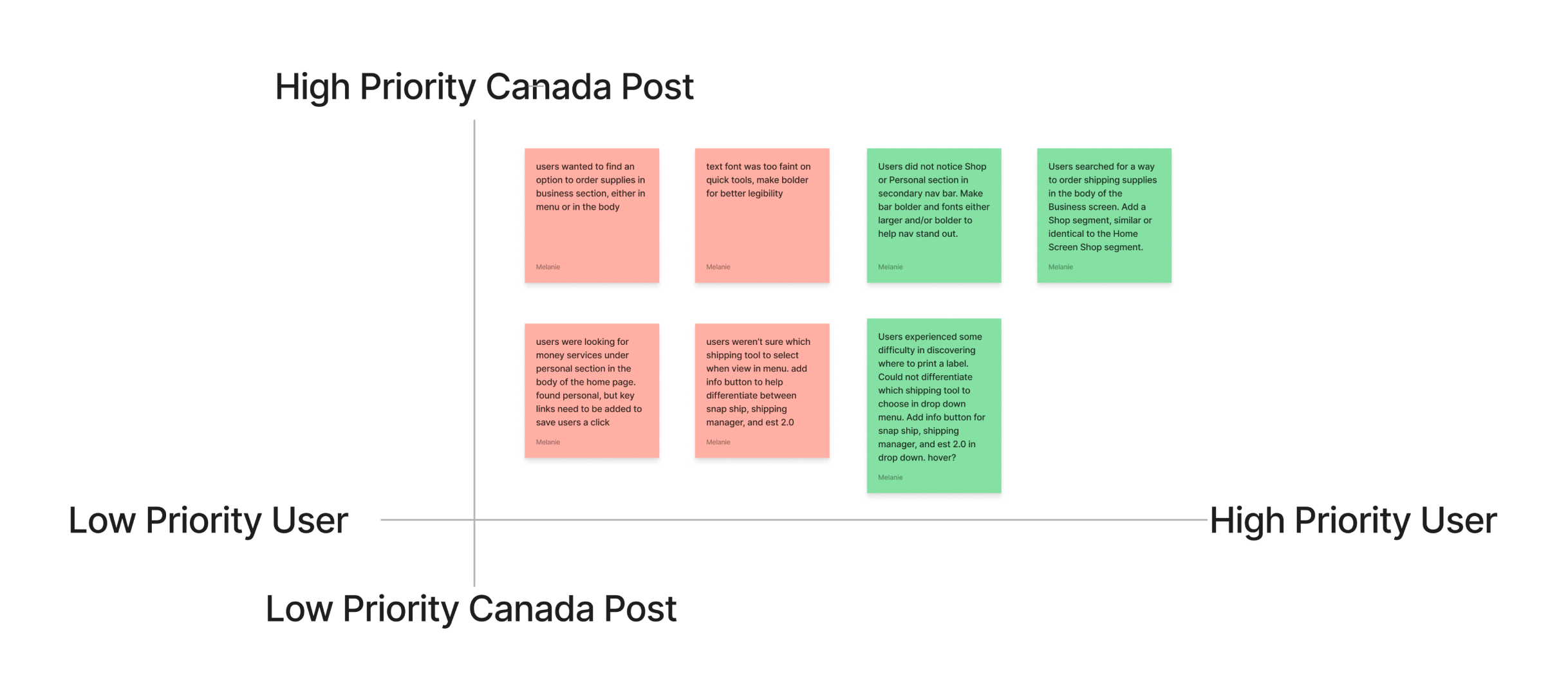
The prioritization matrix and competitor analysis revealed opportunities for improvement, drawing inspiration from successful shipping service providers like FedEx, UPS, and Amazon.
Define
Proto Persona
Paul Packages symbolizes the typical user who relies on the website for shipping, tracking, and accessing various services. Paul's persona helps to empathize with users, guiding the redesign process to meet their needs effectively.
Journey Map
At this point in the research, I began working on my own. I began with developing a journey map highlighting Paul's experience throughout the process, including moments of frustration, confusion, and the need for breaks. It showcases the importance of clear instructions, intuitive navigation, and user-friendly interfaces to minimize friction in the user journey.
Ideate
Information Architecture
Closed card sorting was employed to initiate the navigation redesign process. I documented Canada Post's primary and secondary screen navigation, including the footer. The cards were then shuffled and rearranged, with different colored sticky notes used to distinguish global, primary, secondary, and tertiary navigation.
Lo-Fidelity Wireframes
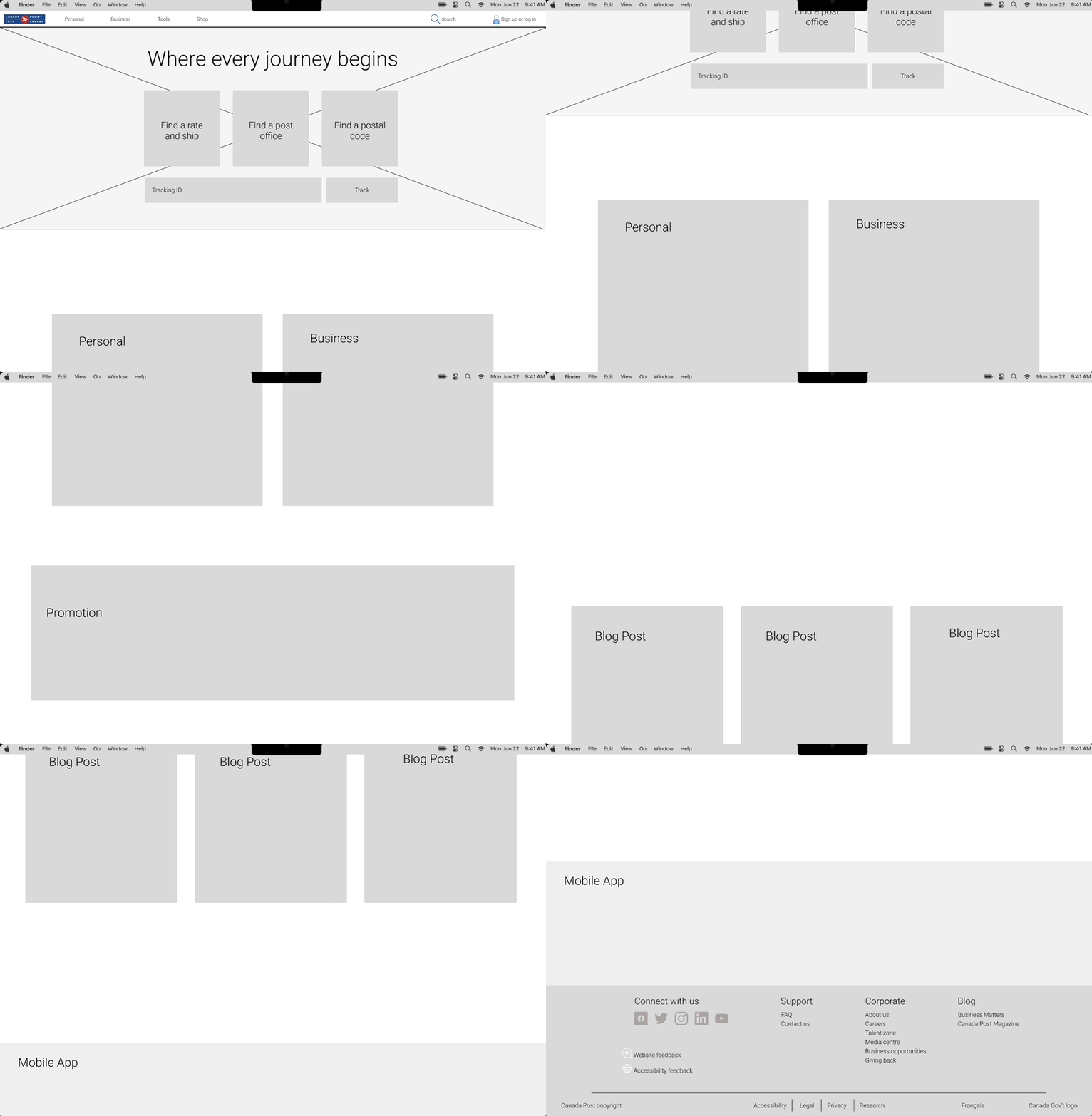
The redesign focused on three key areas: Global & Primary Navigation, Quick Actions Navigation, and Footer Navigation. The primary goals were to simplify options, enhance visibility, and provide context to ensure a smooth user experience. By restructuring dropdown menus, simplifying and organizing sections, and improving clarity and usability, the redesigned information architecture aimed to address user confusion, improve section awareness, and facilitate finding specific information.
Navigation Solutions
Prioritized primary navigational tools, especially the tracking feature, based on user research. Initially, users struggled to find quick access to these key tools.
Focused on improving drop-down menus and optimizing the hero space on the Home Screen. Initial drop down menus were horizontally full screen, and links were disorganized and excessive.
Based on user preferences and intuitive behavior, the primary navigation was redesigned by removing the "Our company" section and incorporating key links from that menu into the footer. Language options were also added to the footer to better cater to user needs.
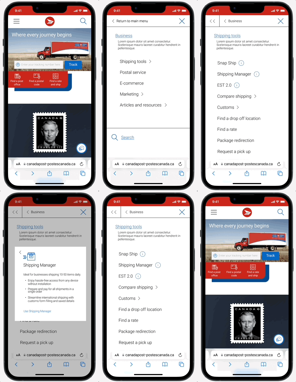
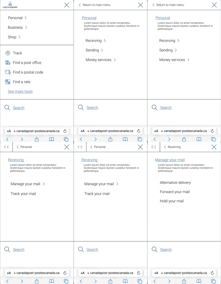
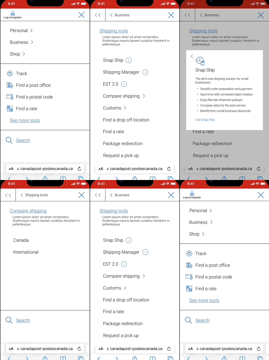
The mobile primary navigation was transformed into a full-screen layout for better accessibility, accommodating users with vision challenges and touch screen issues, while also reducing user fatigue by minimizing the number of tertiary links within the secondary menus.
Prototype
Style Guide
Hi-Fidelity prototype
Mobile
Desktop
Test
Remote moderated testing
A final series of user tests were conducted to assess the effectiveness of the redesigned website. Participants completed tasks while providing feedback, and their experiences were again measured using SUS and SEQ scores. The findings showed significant improvements in usability scores and user experience.
Although there was a marked improvement in the usability scores and user experience, it was noted that there was still potential for further enhancement. Based on the feedback received, it was determined that another round of iterations was necessary to address the remaining areas of improvement.
Iterations
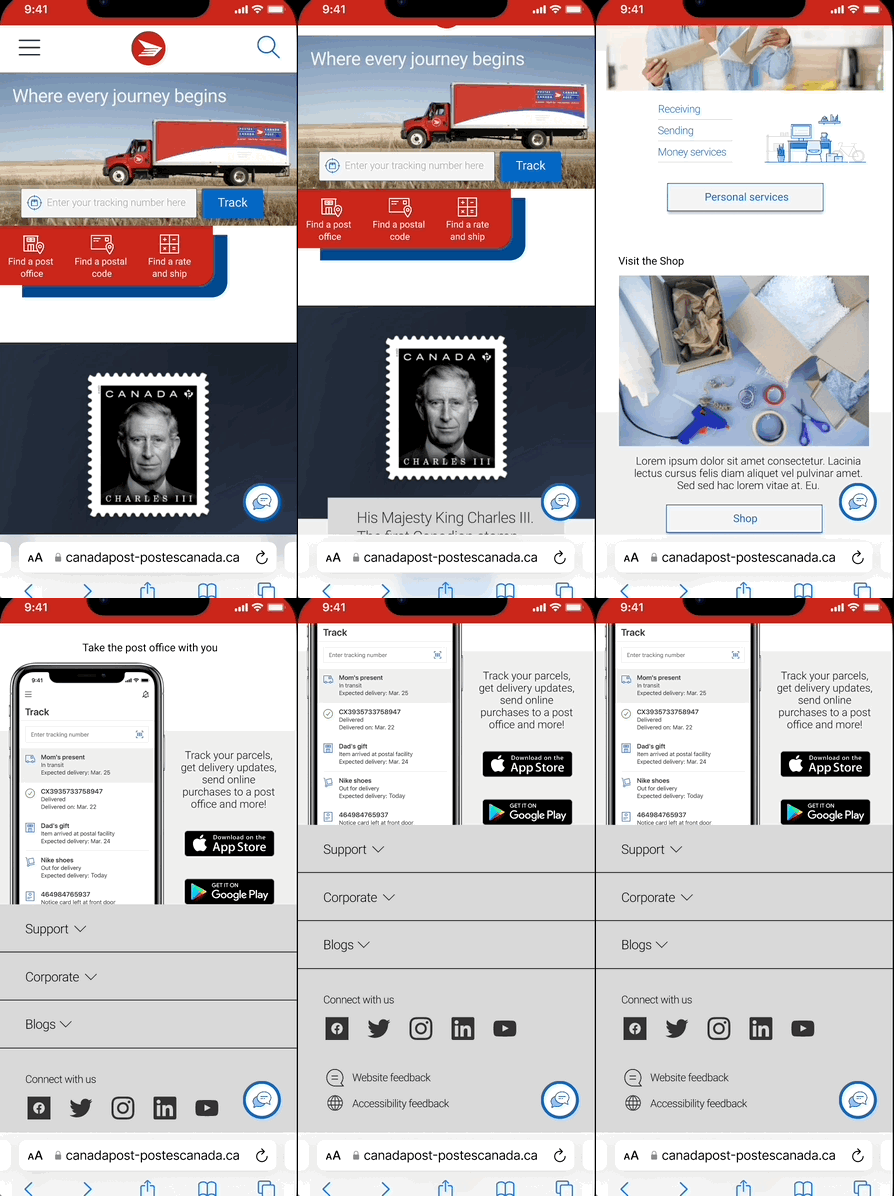
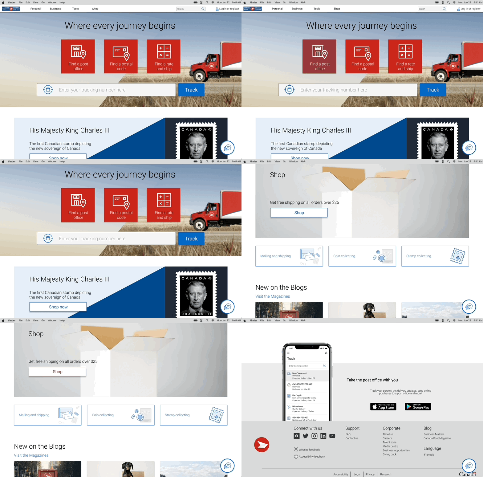
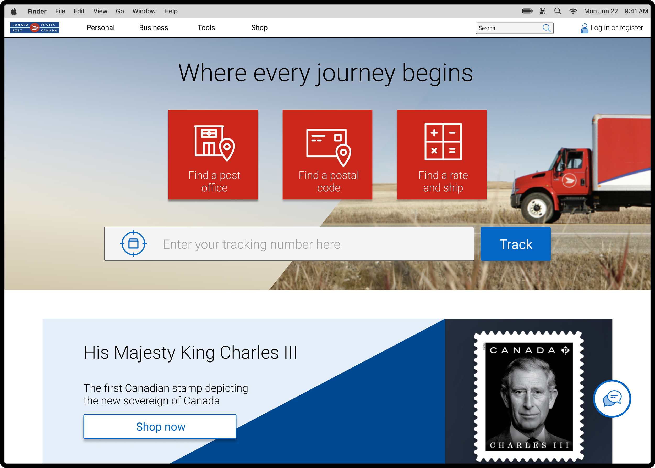
I optimized the home space of Canada Post's website by prioritizing the primary tools commonly used by shippers, based on extensive research.
The product push, which was removed from this placement, was strategically positioned at the top of the page to maintain its importance. Furthermore, feedback from user testing showed that the tracking input field and button required increased visibility, resulting in further iterations with larger dimensions.
I introduced color to the secondary navigation bar and increased the font size to enhance its visual impact. I also switched the font from light to regular to improve legibility and make it more noticeable.
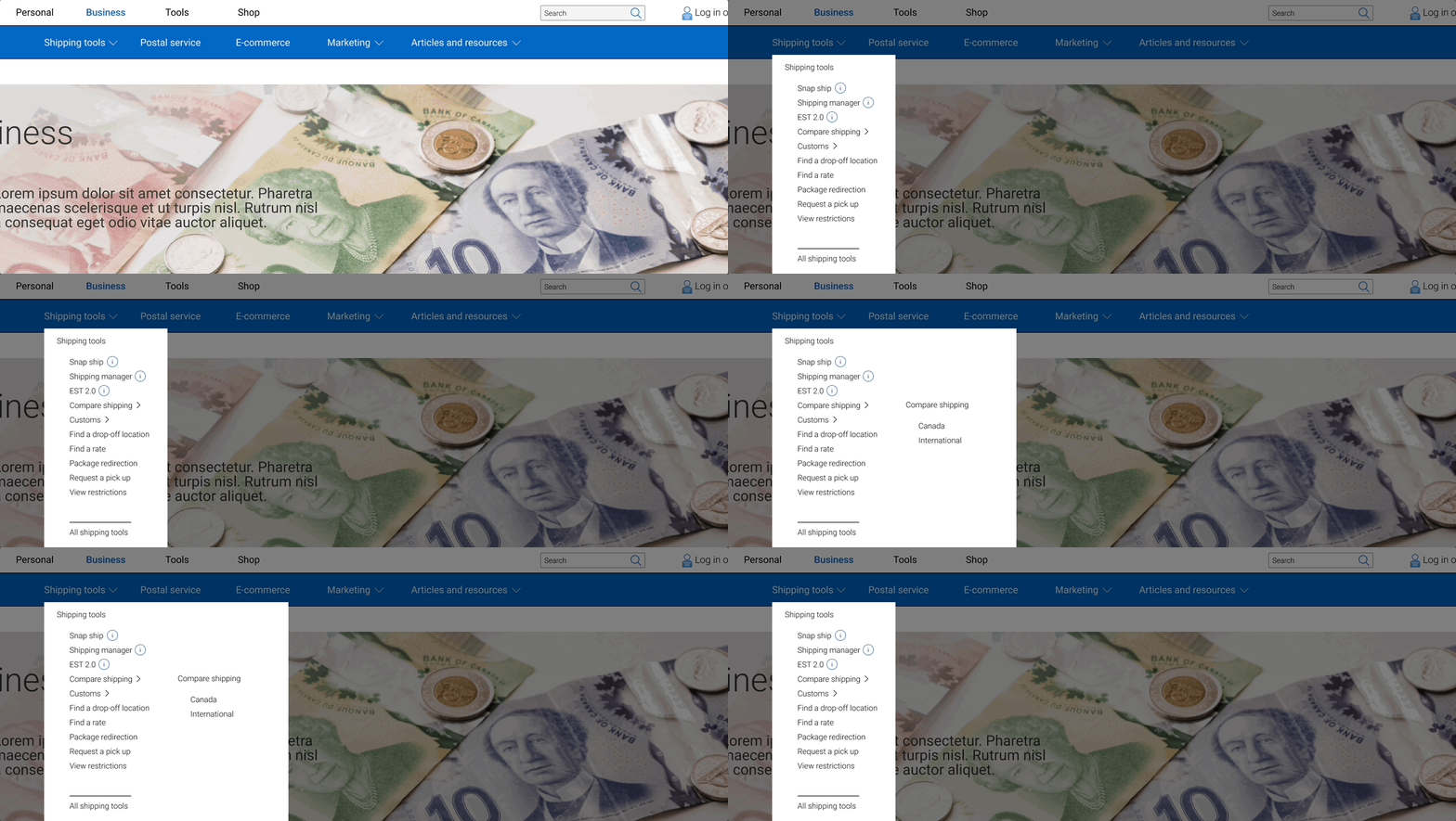
I optimized the drop-down menus for a more streamlined look. In addition, I focused on keeping the information minimal and arranged the items based on a hierarchical order first, followed by alphabetical order.
Copy was updated on each of the business postal services/shipping tools Canada Post offers. During the initial testing, users were unsure of which to choose, often selecting the least compatible tool for their task. Users found this copy clear comparatively to the initial copy, and detailed enough that they did not have to advance to a secondary screen for clarity.
Icons conveying information were incorporated into the menus to assist users in determining the most suitable shipping tool for their needs without the need to navigate to a separate page. This was initially causing user confusion, as they did not know what each of these options meant until clicking on them an being redirected to a new page.
On desktop the details are revealed on hover over the icon. This was also created for the mobile, with the icon being on click, with a pop up.
Quick tools on the previous website were often overlooked by users on both mobile and desktop. To address this, I introduced a persistent tool bar located below the hero space, ensuring its presence across all pages for mobile and desktop users. The only exception is the Home Screen of the desktop version, where these tools are already prominently displayed in the hero space.
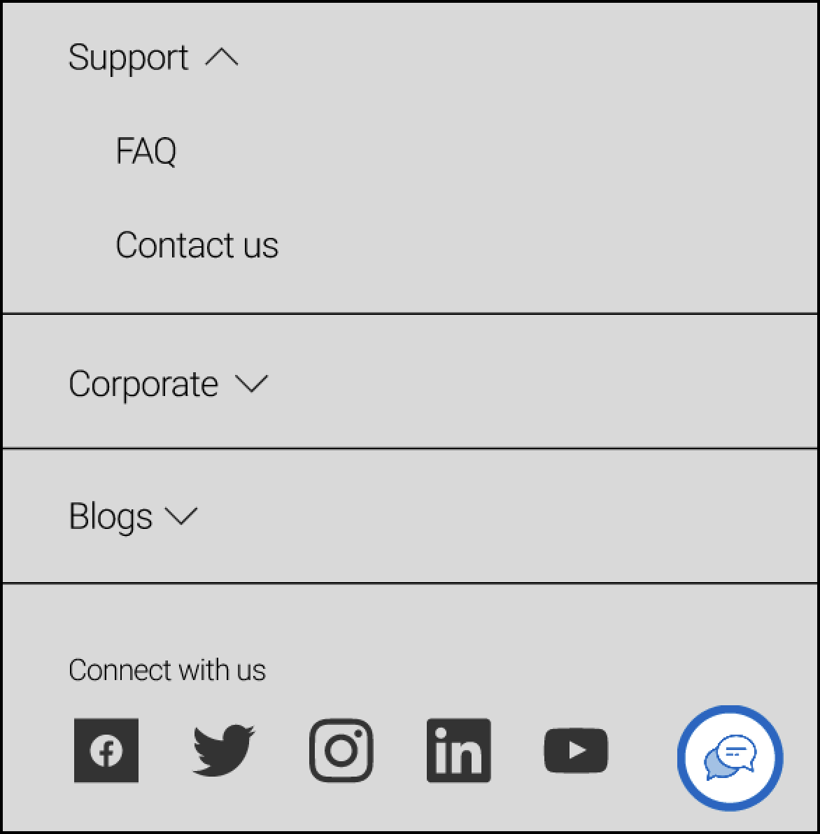
The accordion menu on mobile was kept minimal, and with the same information found within the footer on the desktop, to maintain continuity between devices.
In the lo-fi design, a hamburger menu was implemented to enhance mobile navigation. To provide easy clarification of services, info icons were incorporated into the shipping tools. Additionally, the menu's navigation was streamlined to reduce user fatigue and improve overall usability.
Five second user test
Upon completion of the website prototype, I conducted a series of five second user tests to assess the effectiveness of the homepage and navigational elements in Canada Post's website redesign, aiming to capture users' initial impressions, measure clarity and efficiency, and optimize overall user experience.
Most users did not immediately notice where to find support. A fixed chat button was added to both mobile and desktop screens, for quicker access.
Final Design
Mobile
Sketch
Lo-fidelity
Final hi-fidelity
Desktop
Sketch
Lo-fidelity
Final hi-fidelity
Final Thoughts
The redesign of Canada Post's website information architecture successfully addressed usability issues and significantly improved the user experience. Through the implementation of intuitive navigation, enhanced visual design, and improved clarity, Canada Post can now provide its customers with a seamless and satisfying online experience. The case study highlights the importance of user research, testing, and iterative design to create impactful solutions that align with user needs and preferences.
Impact
The redesign of the Canada Post website successfully improved the user experience by enhancing navigation while preserving the iconic branding, leading to increased usability and reduced user frustration.
Positive outcomes are anticipated, including improved customer satisfaction and streamlined operations.
Based on the final round of user testing, substantial progress was observed, with an 18.5% increase in the System Usability Scale (SUS) score and an 18% improvement in the average Single Ease Question (SEQ) score.
Next Steps
Moving forward, the design process will encompass various future steps, including but not limited to:
1. A/B Testing: Validate design elements through A/B testing, such as drop-down menus, to ensure optimal effectiveness and usability.
2. Tablet Version: Develop a tablet-optimized website for seamless navigation and interaction on all devices.
3. Iterative Refinements: Continuously improve the website based on user feedback and insights gathered through ongoing user testing.

